How many colors can your printer produce? A printer’s color palette helps determine both the quantity and quality of the final print. As printers become more advanced, the palettes are keeping pace with bright, vibrant colors.
But what is the color palette and how does it impact your prints?
Most printers have a handful of color cartridges. For example, the Epson Home Expression XP-400 has 4 ink cartridge colors: black, cyan, magenta and yellow. From those 4 colors, however, a full complement of colors can be created. Depending on how many cartridge colors your printer has (along with the technology and software that actually run the machine), it can literally produce thousands of colors.
Thus, a printer’s palette is all the colors it has to work with – sort of like an artist’s palette. However, many modern printers have a palette large enough that would grab the eyes (nope, not the ears) of Van Gogh. Very impressive stuff, indeed. By adjusting your printer’s color management (usually found in the Printer / Device settings screen), you can determine how those colors interact with each other. Typical options include Photo, Graphic, Proof, etc. The best way to determine your printer’s capability is to print a colorful photograph. Note the differences between the photo on your screen and the finished print – if there is no difference, your palette has all the necessary colors for full-color printing.
Now let’s look at color management, the process that should ensure you’re seeing the right colors through your design workflow.
1. How Can We Describe a Color?
What Is a Color Model?
So if you’re from a print background, you may already be laughing at my simplistic computer-centric red, green and blue view of the world—everyone knows colors are really made by mixing cyan, magenta, yellow and black. But both are equally valid—they’re simply different color models, methods to break down colors into their components to abstract and numerically represent a color.
I assume most designers should be familiar with RGB and CMYK color models. If you are, feel free to skip ahead to halfway through section one for the more obscure but still useful HSB and Lab color models.
What Is the RGB Color Model?
Our first example will be the RGB color model. This model, sometimes described as the additive color model, describes how colored light combines to make colors. Imagine you’re in a dark room with dimmable red, green and blue lamps, and by adjusting the brightness of each you can illuminate the room with any color you wish by mixing their light. If all the lamps are off, you get black—it’s dark! If you mix red and green equally, the room would appear yellow, and then as you turn on the blue lamp, the room will become white.
Why red, green and blue? You may remember from science lessons in school a spectrum of light, described as frequencies, ranging from reds through the colors of the rainbow into blues and purples. From a scientific point of view, light can be a mixture of any of those monochromes, light of a single frequency.
However, we have light-sensing cells called cones in the retina of our eyes to detect the amount of light in the red, green and blue areas of the spectrum. Because of this, “true” monochromatic yellow light, which lies between red and green on the spectrum, is indistinguishable from a mixture of monochromatic red and green light.
From a design point of view, since we can’t perceive the difference, it simply does not matter, and so we can abstract any color we can see as a mixture of red, green and blue.

Spectrum of monochromatic colors
Due to this fact, many devices, such as monitors, TVs, and color-changing LEDs, reproduce light with red, green and blue emitting light sources. Similarly, light-capturing devices, such as cameras or scanners, mimic the human eye with sensors of these three colors.
In the digital world, Red, Green and Blue components are often described as numbers between 0 and 255. Why 255? You can blame programmers for this—it’s due to them being stored as “8-bit” values, which can store 256 different values. You can blame them even more if you have to deal with websites andhexadecimal encoded numbers such as #FF4E3A!
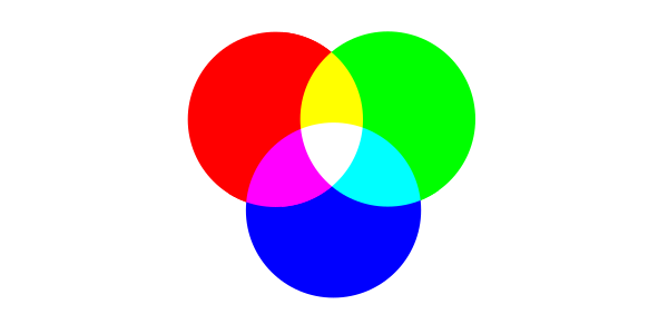
The Red, Green and Blue Additive Model of color
What Is the CMYK Color Model?
So why describe colors in any other way? Well, the print world is a good example. We don’t want to describe the light emitted from our print media; we want to describe the pigment colors in the ink to put on a piece of paper to get light emitted of that color. Surely that’s just red, green and blue again? If you’ve printed or painted before, you’ll know that’s not the case.
Our primary colors in the print world are Cyan, Magenta and Yellow pigments, and by adding two of these on a white piece of paper, we get Red, Green or Blue. Adding the third, we tend to get a muddy brown, but by adding a fourth black pigment, we can mix to get most colors. This color model adds colors to get darker shades, so is sometimes referred to as the subtractive model, but more commonly as the CMYK color model. Typically you’ll see the proportion of each pigment represented digitally as a number between 0 and 100.
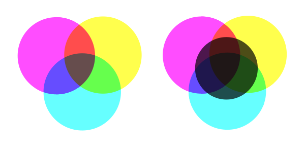
Subtractive mixing of Cyan, Magenta and Yellow can produce most colors, and the addition of black (right) can produce a lot more.
For a nice visual explanation of the RGB and CMYK color models, refer to video: Design in 60 Seconds: RGB and CMYK Color Modes Explained
What Is the HSB/HSV/HSL Color Model?
But there are other color models out there. If you fire up the color picker in Adobe Photoshop CC, or head across to colorizer.org, you’ll also see the HSB color model.
This model represents color as a combination of Hue, Saturation and Brightness, matching how many people tend to think of colors.
Saturation dictates how vivid the resulting color is: a 100% saturated color would be vivid and bold, 50% saturated color a more subtle pastel, and an unsaturated color would be a greyscale.
Brightness (sometimes instead called Value and hence the HSV color model instead) can be thought of as the amount of black in the color, 0% lightness being fully black, 100% being either white or a color depending on our saturation.
Finally, Hue dictates which monochrome color we’re talking about, meaning color as we’d mean it in a rainbow: red, yellow, green, purple, etc. Hue is described as a number between 0 and 360, essentially an angle around a color wheel.
Whilst it has its place, I’ve always found it unsettling that if saturation is 0%, hue can be any value and still mean the same color (a greyscale), and worse, if Brightness is 0%, neither Hue nor Saturation matter a bit, with any values all meaning black.
The related HSL color model shares a definition for Hue, but adds the concept of Lightness, having white and black at its extents, with vivid colors in the middle, and a subtly different but broadly similar saturation.
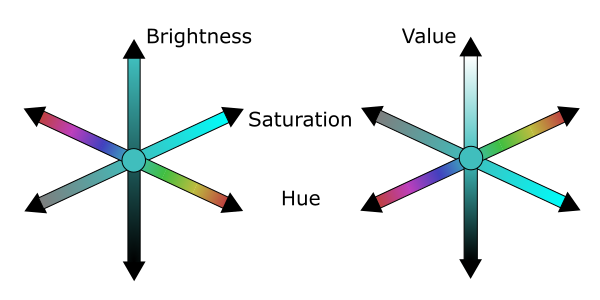
HSB and HSV color models
What Is the Lab Color Model?
The final color model offered by Photoshop’s color picker is the Lab color model, which is a bit less intuitive but more closely approximates how the human visual system works.
“But wait”, I hear you cry, “You just told us human eyes sense red, green and blue!” That is true, it’s called the Trichromatic model of vision, and whilst it does describe how the individual cones in the eye work, it doesn’t accurately describe the visual system as a whole.
It turns out that system is better described by the Opponent model of vision, which suggests the visual system is connected to detect differences between cones rather than the actual values they sense. The system looks at differences in Greenness vs. Redness, Blueness vs. Yellowness and Light vs. Dark.
Mimicking this Lab’s a & b dimension describes color-opponency, the a dimension describing red/green, and the b dimension describing blue/yellow. The third dimension, L for Lightness, is similar to HSL’s definition, but with two main differences. Whereas the other models are based on intensity of light, Lab is instead based on human perception of this intensity. The result of this is that a doubling of lightness actually appears to be a doubling; the same can’t be said for the earlier systems.
Separating the human perception of lightness from color leaves the a & b dimensions as measures of chromaticity, brightness independent of color. This is important, as some colors appear brighter or darker, despite being at the same intensity. For instance, we see a fully saturated yellow as a lot brighter than a fully saturated blue. All of these changes result in a perceptually uniform color model.
Regarding ranges, L is measured from 0 (dark) to 100 (light), a from -120 (red) to +120 (green), and b from +120 (yellow) to -120 (blue).
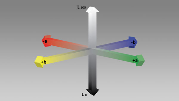
The Lab color model
As this can be hard to grasp from text, refer to video link: Design in 60 Seconds: How to Use Lab Color Mode
Bringing perception into things certainly helps human vision researchers, but does it help designers?
Well, it’s the perceptual uniformity that’s really a boon. For instance, the brightness independence of the chromaticity dimensions can certainly be useful. You can, for instance, tweak the curves in these dimensions to add a bit more blueness without changing the perceived brightness of an image.
Are There Other Color Models?
Can we break down color in other ways? Certainly! Keeping Lab’s perceptually independent description of Lightness, what if we broke the chromaticity into Hue and Saturation like HSV? We’d have the Munsell system, although it calls saturation “Chroma” and Lightness “Value” and tends to be used for soil research, rather than design!
colorizer.org is a fantastic way to understand these systems, offering sliders for all the different dimensions of the different systems. You’ll see some more color models such as YPbPr and XYZ. These again are more specialist models, less useful to the designer, but handy for video codec developers to squeeze a bit more content into our bandwidth.
Moving away from the digital, systems such as Pantone could be described as color systems, being a standardized way to abstract colors, allowing two remote designers with the same swatch to know they’re thinking of the same Cerulean or Hot Pink!
If we move away from human eyes, looking at animal perception of color, infrared cameras or even satellite data, suddenly we have sensitivities at frequencies other than red, green and blue. We then move into the area of false color images to make unseeable colors understandable.
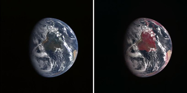
False color imagery NASA
2. How Can We Accurately Describe a Color?
Coming back to day-to-day design, it is when we move between these color models that why I was wrong becomes most evident. Perhaps you’ve gone through the pain of perfecting a piece of media to exactly the right shades of color you want, only to print it and find all the colors reproduced subtly differently.
If a document calls for 100% Red or 100% Cyan, what is that a proportion of? Given no other clue, it will be 100% of what a device can give, a fully bright red pixel or a full covering of Cyan ink. There are two main issues with this: the capabilities of devices differ, so fully red will appear different between monitors, and secondly, how do we move between color models whilst accurately representing colors?
To do this properly, we require Color Management. I’ll describe this fully in section 3, but first we need to understand color spaces, color models’ more precise sibling.
How Ink Is Made
What Is a Color Space?
Color spaces precisely specify a mapping from the description of a color to how it should be reproduced. These color spaces specify exactly how the components’ colors should be represented, precisely how a mixture of these primaries should appear, and at what real-world brightness any given value should shine from a screen.
The notion of a color space works for any color model. Pantone, which I mentioned earlier, is actually better described as a Color Space as it describes precise colors. There are common color spaces for RGB and CYMK, but first we’ll look at Lab to learn a few more concepts.
CIE Lab and XYZ Color Spaces
Exactly what the L, a & b dimensions of a Lab color model measure depends on which Lab color space they are referring to. The initial Lab color space came from Richard S. Hunter in 1948, but the International Commission on Illumination (CIE) gradually improved the exact definitions for the Lab values for better approximation of human perception in the CIE 1976, CIE 1994 and CIE 2000 color space definitions.Technically, the CIE dimensions should be referred to as L*, a* and b* as they are defined differently to the Hunter 1948 dimensions, but I’ve followed Photoshop’s Lab usage.
Each of these systems is based on and defined in XYZ values from the earlier CIE1931 XYZ color space. Unless you’re interested in the human visual system, the details of these are immaterial, except for the fact that X & Y are measures of chromaticity again, and we can ignore lightness to map all the colors on an XY scale of chromaticity; we term this a chromaticity diagram. In the chromaticity diagram shown below, the arching curve shape is the range of colors human vision can see (chromaticities, really, as we have no lightness). Where this diagram really comes in useful is for comparing the ranges of different color spaces.
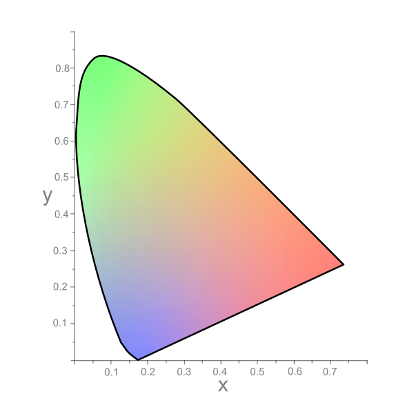
Chromaticity Diagram showing range of Human Vision within CIE 1931 xy color space
What Is a Color Gamut?
The range of a color space is described as its gamut. You may find color space and color gamut used somewhat interchangeably, but the best way to understand the difference is to look back at the CIE 1931 Chromaticity diagram above. The colored area is the color space of human vision, and the thick line noting the extents is the color gamut of human vision.
sRGB Color Space
Color gamuts are useful when we come to describe color spaces. Let’s take a look at sRGB to demonstrate this. If you’re feeling brave, you can take a look at the sRGB color space specification. The sRGB color space can be thought of as a default color space for the RGB model. Almost all capture and display devices working in the RGB color model support sRGB as a minimum.
Take a look at the Chromaticity diagram below—the triangle shows the gamut of sRGB in comparison to Human Vision (CIE1931). As you can see, a lot of the areas inside the gamut of Human Vision are outside the gamut of the sRGB color space. Essentially, these are colors that we can see but that cannot be represented within the sRGB color space, and such colors are referred to as Out of Gamut for the sRGB color space. The fact that so much of human vision is outside the sRGB color space explains why it is a minimum, and tends to be considered a narrow gamut color space.
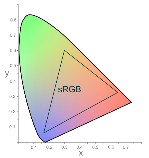
Chromaticity Diagram showing sRGB color space compared to Human Vision (CIE 1931)
Have you spotted the artistic licence I’ve taken with the chromaticity diagrams? If your monitor is only displaying sRGB, why aren’t all the colors in the sRGB triangle? And how can you see colors outside it?
In reality, the colors along the arching edge of the diagram are the pure monochromatic colors; the three corners of the sRGB triangle will be the best green, blue and red a monitor can reproduce. I’ve just stretched the range of colors over the range of human vision to better illustrator the range.
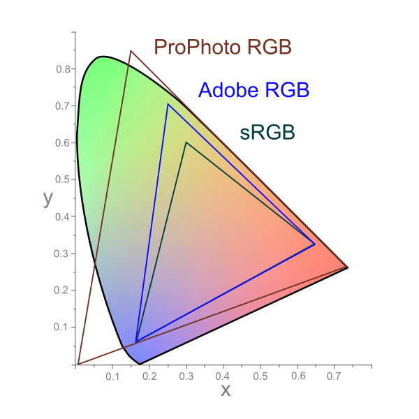
Adobe & ProPhoto RGB Color Spaces
What if we want a color outside the sRGB color space but still in the RGB model? We need a wider gamut RGB color space.
There are many, but we’ll look at two major ones. Firstly there’s the Adobe RGB color space, introduced in 1998, which, as you can see below, allows a better representation of greens over sRGB.
Secondly, Kodak’s ProPhoto RGB, otherwise known as ROMM RGB, offers a vast color space. In fact there are spaces inside the ProPhoto RGB color gamut that are out of gamut for CIE 1931, suggesting that deeply saturated blues and greens in this color space represent colors the human eye can’t actually see!
ICC Profiles
Okay, so which RGB color space does my camera/monitor/scanner use? Likely none of them! Whilst they may be close to a standard color space, each model of a device will have its own color space.
Due to this fact, the International Color Consortium came up with the ICC profile, a way of defining and sharing device-specific color spaces. Such a space may be available from the manufacturer, or you can generate it yourself as described in section 3.
CMYK Color Spaces
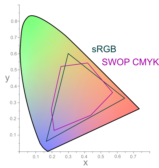
Moving away from the RGB color model, we’ll look at CMYK color spaces. This is a lot more complex due to requiring information not just about the inks, but also the paper and other details of printing. Take a look at this guide to see the range of profiles available. We’ll just take the American Web Coated SWOP color space.
The irregular hexagonal space is the gamut for SWOP, and I’ve also thrown in the triangular gamut of sRGB again so we can compare them. We’ve got some out of gamut colors for each color space in relation to the other, so the implication is we can’t trivially move between CMYK and RGB—we need Color Management.
3. What Is Color Management?
So know you (hopefully) understand color spaces, but how do you actually use them? By using a color managed workflow.
Color Management is a chain of systems to manage color through the workflow of a piece of media. It includes:
- the management of color spaces in media files
- the conversion between color spaces
- the characterization and calibration of devices to accurately display (or capture) in a color space
Characterization/Calibration of Devices
So the first step will be ensuring we are seeing color properly on our device. As we’ve already touched on, devices will have their own color space, referred to as an ICC profile. This profile may be available from the manufacturer, but to be really accurate it’s best to generate it yourself, as devices can differ due to manufacturing tolerances and environmental conditions.
Characterisation is the process of measuring a device’s capabilities. It is achieved by Colorimetry, measuring the appearance of colors as perceived by people, with a Colorimeter.
A step further is to take this characterization and tweak the device’s reproduction for a more true representation of color; this is termed Calibration. Typically, display colorimeters will come with software to calibrate a display, and then do a final characterization to generate an ICC profile.
————
Refilled Ink Cartridges
Refilled cartridges will typically provide every spectrum of the printer’s color rainbow & essentially on-par with original manufacturer’s ink quality and performance. Our refilled inks are fully compatible with HP, Canon, Epson & Brother printers. With a streamlined operator-assisted ink refill process, we provide OEM quality at bargain-basement costs. To find an ink cartridge refill store location or if you have any questions about your particular printer’s color palette, please choose from the links below.
————
Refilled Ink Cartridges
Refilled cartridges will typically provide every spectrum of the printer’s color rainbow & are essentially on-par with original manufacturer’s ink quality and performance. Our refilled inks are fully compatible with HP, Canon, Epson & Brother printers. With a streamlined operator-assisted ink refill process, we provide OEM quality at bargain-basement costs. To find an ink cartridge refill store location please choose from the links below.
—
Find an Ink Cartridge Refill Store Near You (USA, Canada, France & Germany)
Premium ink refilling services are provided by major retailers in the USA, Canada, France & Germany. To find the nearest refill store and ink pricing, refer to links below:
Auchan, E.LeClerc, Cora & Intermarche France
Worldwide Ink Refill Store Locator
Retail Inkjet Solutions (Ink Refill Equipment Provider)

—–
For questions regarding refilled cartridge usage, printer questions/problems, new cartridge support offerings or ink refill locations please Contact Us.


